Visual Communication
- Submitted by: nikita211
- Views: 364
- Category: Arts
- Date Submitted: 04/16/2014 12:38 AM
- Pages: 5
- Report this Essay
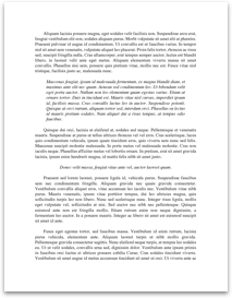
Analysis Grid – Stravaganza City of Masks
Design field: The VC belongs to the field of Communication design because it is part of graphic design of books layouts.
Audience Characteristics: The VC is targeted at audience between the ages of 13-18 specifically aimed at female teenagers. The socio economic status of the VC would be low to medium income since the prince of the book is euros is 5.99 featured on the book which would be converted to about $9.00 in Australia. The target audience fall in the category of suburban dwellers since the book is not very common or popular even though it’s based on the city of Venice, Italy. The book would most likely be appealing to a group of individual who are interested in a mystery and fantasy theme of books and also have interest in the city of Venice in the sixteenth- century.
Technique for maintaining engagement: The description of the VC contains adjectives to describe the book such as “An extraordinary novel”, “A compelling, powerful novel” and such which catches the attention of the readers. These adjectives are also featured differently based on the elements and principles which play a part in the hierarchy of the book. The way the descriptive words are designed on the book cover whether the type is white and bold contrasted on a purple ground, whether it is symmetrical on top of the page it affects the way the audience see the cover and engage with it.
Design elements:
* Type: Type is the most essential element in the book layout as it is what the VC is all about. On the front cover of the book the title of the book has been used in two different fonts and colours both serif and gothic. The “stravanganza” heading was used in a silver glittery design and the “city of masks” was used in a white colour contrasted on a purple ground making it stand out to the audience eye. Different sizes of font were used in the composition in order of importance for instance, “An extraordinary novel” following the next word...