Deceptive Facts
- Submitted by: jmartin184
- Views: 123
- Category: Other
- Date Submitted: 10/28/2015 07:08 AM
- Pages: 3
- Report this Essay
Deceptive Facts
Everyday people are exposed to thousands of different types of media gimmicks. Whether it is from advertisement or from news sources. News sources such as CNN and especially Fox News may be the worst at doing this to get their point across. Even when the source is giving you facts they still may be deceiving you from what the real truth is. It is important to know what you are looking at and how to confirm that the source is accurate. There is a six step process on what do when you encounter tricky information.
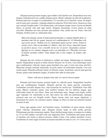
The statistic that I chose is the number of people that are on welfare and the number of people that have full time jobs. According to the bar graph on Fox News there are 108.6 Million people on welfare compared to 101.7 Million with full time jobs. The main thing that makes this graph sketchy is because what the reader is not informed. The reader does not know that if one person in a house is on welfare then all of the members in the house are counted towards the 108.6 Million. While on the other hand the people with full time jobs, people that reside in the same house do not count towards the 101.7 million. This is making the facts skewed towards the republicans. They want to make it look like people are receiving more benefits from the actual people working paying taxes. They also make the bar for 108.6 Million way bigger than the 101.7. This is a little strategy compared to the other one they used for this specific graph but theu both work in their own ways.
When one is encountering certain information they need to go through a series of steps to analyze and confirm the information is correct. One of the questions is what kind of content am I encountering? The type of content that I am encountering is a type of bar graph that was showed on a news report on television or some sort of graph to help support an article. The next question to ask is if the information is complete. With the graph that I saw it was almost...
Everyday people are exposed to thousands of different types of media gimmicks. Whether it is from advertisement or from news sources. News sources such as CNN and especially Fox News may be the worst at doing this to get their point across. Even when the source is giving you facts they still may be deceiving you from what the real truth is. It is important to know what you are looking at and how to confirm that the source is accurate. There is a six step process on what do when you encounter tricky information.
The statistic that I chose is the number of people that are on welfare and the number of people that have full time jobs. According to the bar graph on Fox News there are 108.6 Million people on welfare compared to 101.7 Million with full time jobs. The main thing that makes this graph sketchy is because what the reader is not informed. The reader does not know that if one person in a house is on welfare then all of the members in the house are counted towards the 108.6 Million. While on the other hand the people with full time jobs, people that reside in the same house do not count towards the 101.7 million. This is making the facts skewed towards the republicans. They want to make it look like people are receiving more benefits from the actual people working paying taxes. They also make the bar for 108.6 Million way bigger than the 101.7. This is a little strategy compared to the other one they used for this specific graph but theu both work in their own ways.
When one is encountering certain information they need to go through a series of steps to analyze and confirm the information is correct. One of the questions is what kind of content am I encountering? The type of content that I am encountering is a type of bar graph that was showed on a news report on television or some sort of graph to help support an article. The next question to ask is if the information is complete. With the graph that I saw it was almost...