What's Important
- Submitted by: gailuck
- Views: 855
- Category: English
- Date Submitted: 03/27/2010 03:36 PM
- Pages: 7
- Report this Essay
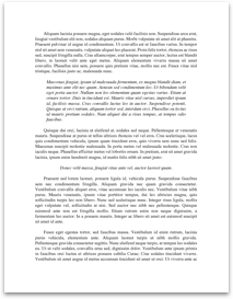
Newsweek magazine cover dated January 25th 2010. Centered on the top of the cover page is a 16 ½ cm x 4 cm block of red within which are white words in 80 point bookman old style font which read - Newsweek. Immediately above the magazine’s name and also centered within the same red box, are two featured stories printed in all capitalized, black, 12 point calibri bold font. The feature stories read “BILL CLINTON: THE WORK AHEAD. LISA MILLER: DOES GOD HATE HAITI?”
Inserted directly above the double “e” in Newsweek is the magazine publication date: January 25th 2010 in white 10 point font bookman old style.
Hanging just over 1 ½ cm to the left bottom edge of the red box are three words which reflects the main story. These words are printed in white; all capitalized and contain two different font sizes. The words read “WHY HAITI MATTERS. The words that flank either side of the word Haiti are in a font size about 1 ½ points smaller than that of one of the world’s poorest nations. Instantly our eyes recognize the familiar name of the article author, Barack Obama, the incumbent President of the United States of America. The President’s name is written in 18 point white calibri font which is twice as small as the word Haiti.
It is at this point one is made to stop and consider why would of the world’s largest weekly and bi-weekly publication magazine choose to use such varying sizes of not so typical fonts on the cover of its magazine? Is there significance in the varying font sizes? At first the fonts appear haphazardly chosen, but as one is drawn towards the word Haiti, one can begin to glean the purpose behind such a decision. Haiti is the focus of the current affairs magazine, and the focus significant enough to warrant it bold compelling font. The unfamiliarity of the font style is like that of the republic of Haiti for many Americans, a nation somewhere in the Caribbean which is lost amongst the hundreds of other more recognizable islands within the same...